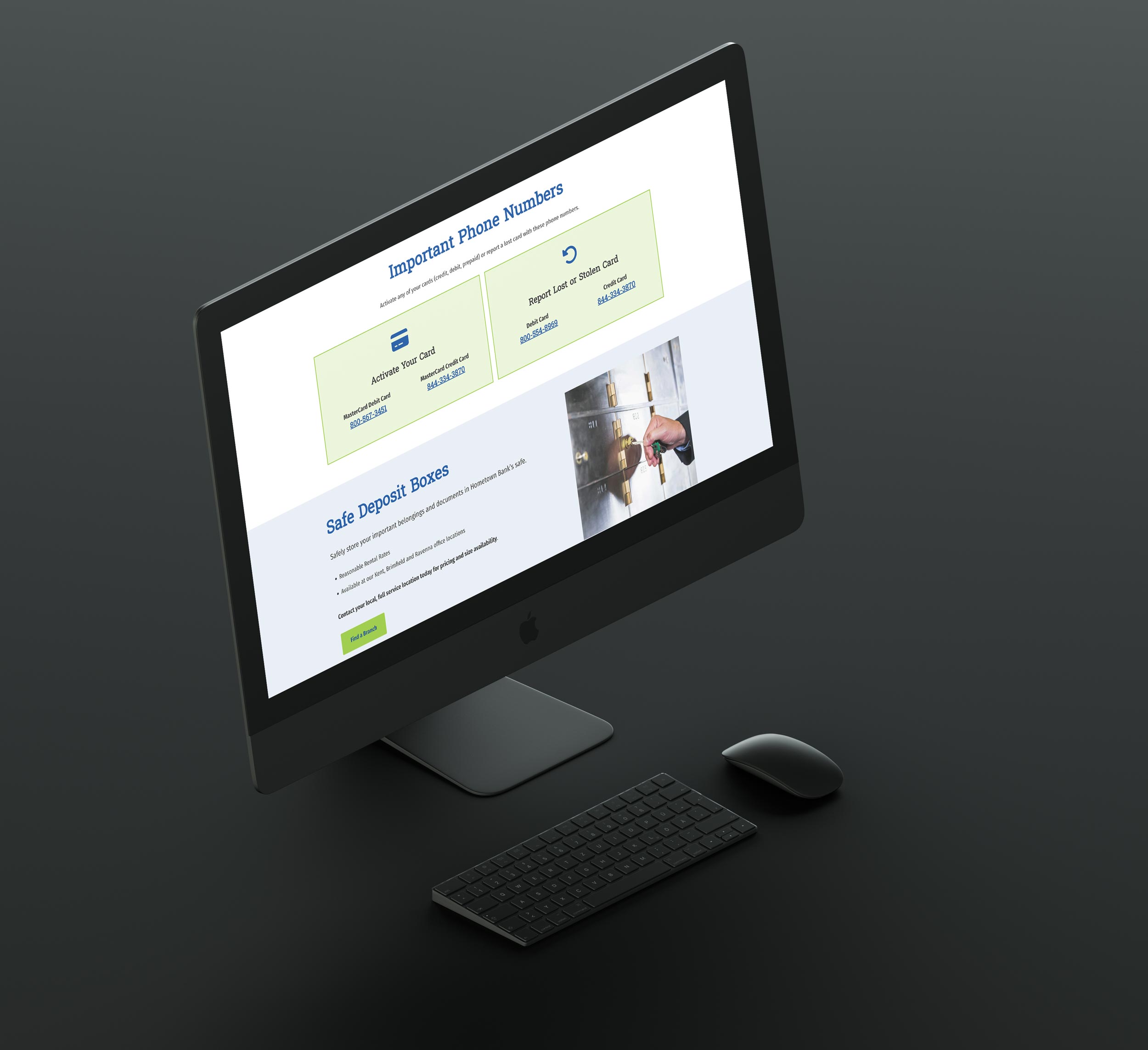
My goal for this site was to drastically improve the structure and the mood of the website. Their former site was very gray and lacked that welcoming feeling you want when visiting a customer service focused website. Brighter colors and rounded section separations really lightened up the site while more imagery and iconography helps to break up more informative sections into digestible chunks. With a focus on meeting WCAG AA 2.2 standards I believe we achieved that goal.
User experience is not limited to the customer, there is also a heavy focus on making the back end of the website as easy as possible for a client to manage and update their site themselves. While the WordPress platform is known for ease of use, I’ve set up custom post types for repeating information like locations, people, and events so the client never has to think about the design of these elements. They type in the information for a simple, repeatable editing process.
click an image to enlarge


